“Don’t mistake legibility for communication”.
 I am fond of many Graphic Designers such as Paul Rand and Saul Bass but I feel David Carson stands out personally for me. David Carson is an American graphic designer and typographer, his work is a little more abstract from other designers as his work can sometimes be illegible, the style of work by Carson became very popular in the 90’s, but he had been designing and working in the industry since the beginning of the 80’s. David Carson has produced a range of books displaying his work, one book called the end of print displaying his graphic design work, he has also worked on magazines, one called Surf Culture. This magazine was typically his work, looking at it you could see straight away it was David Carson, his unique way of working with text and layout, even down to his colour palettes that obviously run through his articles.
Carson did not study Graphic Design at school it was something he came across later in life. He was a professional surfer and sociology graduate. You can see his love of surfing through some of his work in surf culture magazine. One of the things i love most about Carson’s work is he was not afraid to break the rules. He would turn letters the wrong way round, back to front or upside down. He would use different font sizes, different fonts and yet he still managed to make his work look like art and not a bunch of letters thrown over one another.
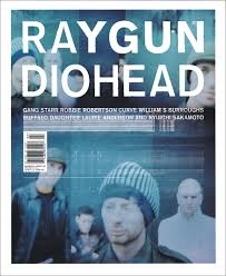
Carson worked for a magazine called Ray Gun, which was an alternative rock and roll magazine. This was the magazine that made him well known! In issue three he turned the picture on the front upside down. He would muddle up everything on the page, and although it was confusing at times is was inspiration and this is what he’s known for.
In this issue featuring Radiohead Carson though i’ve already got the ‘R+A’ in RAY GUN i don’t need it in RADIOHEAD too. So therefore he combined the two words.

